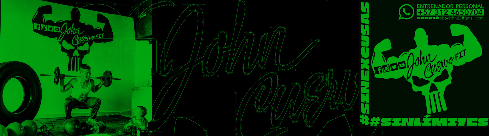
LOGIN

• Custom Lettering | Pedro Capó | 2020, San Juan, Puerto Rico.

Previous slide
Next slide

1) Description: With art direction by Lennyn Salinas and illustration by Puerto Rican plastic artist Alexis Díaz, we tested sans capital letters that would solve the visual difficulty of inserting the word MUNAY inside illustrated pages.

2) Process:
 With pencil and Bézier sketches, organizational purposes were established, promoting homogeneity in the design of empty and full spaces. The set of successive drawings led to various changes and tests of the word MUNAY over the extended and sometimes condensed widths of each letter. In summary, the selected design assigns geometric and adaptable showiness to the shape of illustrated leaves so that the letters match the concept of vegetation and the Amazon jungle.


3) Details: According to the confrontation tests, several letterings were especially evaluated preserving the sans style of the word MUNAY. In order to achieve similarity and unity, some ligatures were drawn to help with the rhythm of the letterings: “earth, air, water and fire”. As it is, different possibilities of calibers were tested without modifying the condensed width and the low amount of contrast between thick and thin lines.


1) Descripción:  Con dirección de Arte de Lennyn Salinas y la ilustración del artista plástico puertorriqueño Alexis Díaz, testeamos letras sans mayúsculas que resolvieran la dificultad visual de insertar la palabra MUNAY dentro de hojas ilustradas.


2) Proceso:  Con bocetos a lápiz y en bézier se establecieron propósitos de  organización, fomentando homogeneidad en el diseño de vacíos y llenos. El conjunto de dibujos sucesivos llevaron a diversos cambios y pruebas de la palabra MUNAY sobre los anchos extendidos y a veces condensados de cada letra. En resumen el diseño seleccionado asigna vistosidad geométrica y adaptable a la forma de hojas ilustradas para que las letras hagan juego con el concepto vegetación y selva Amazónica.


3) Detalles: De acuerdo a las pruebas de confrontación, especialmente se evaluaron varios letterings conservando el estilo sans de la palabra MUNAY.  Con el objeto de lograr semejanza y unidad se dibujaron algunas ligaduras que ayudaran con el ritmo de los letterings: “tierra, aire, agua y fuego”. Tal cual se ensayaron distintas posibilidades de calibres sin modificar el ancho condensado y la baja cantidad de contrastre entre trazos gruesos y finos.


• Editorial Design | Suecia, Noruega | 2019, Neiva, Huila, Colombia.

Previous slide
Next slide

1) Description: To know how many pages a book has and consider it as such, it must have a minimum of twenty-five pages (49 pages). Less than this we would speak of a brochure. In that order, artistically directed by N. Giovanny Rodríguez U., we designed a small closed half-letter size book of 85 pages with illustration, design, assembly and editorial composition.

2) Process:
 In order to abstract the reader from distractions, concentrating exclusively on what is written, we chose Minion Pro as the typeface family to compose text and in the headlines we use the Sanvito typeface, both typeface families designed by Robert Slimbach.


3) Details: The cover of the book was designed from a lettering based on Carol Twombly’s trajan typography. Then, the ease of reading prevailed in the internal pages of the book, dividing chapters with title pages accompanied by brightly colored illustrations with brushstrokes of nature and an important emotional charge.

1) Descripción:  Para saber cuántas páginas tiene un libro y considerarlo como tal debe poseer veinticinco hojas mínimo (49 páginas). Menos que esto hablaríamos de un folleto. En ese orden, dirigido artísticamente por  N. Giovanny Rodríguez U. diseñamos un pequeño libro tamaño media carta cerrado de 85 páginas con ilustración, diseño, armado y composición editorial. 


2) Proceso:  Para lograr abstraer al lector de las distracciones alcanzando exclusivamente su concentración en lo escrito, elegimos Minion Pro como la familia tipográfica para componer texto y en los titulares utilizamos el tipo de letra Sanvito, ambas familias tipográficas diseñadas por Robert Slimbach. 


3) Detalles: La portada del libro se diseñó a partir de un lettering fundamentado en tipografía trajan de  Carol Twombly. Luego la facilidad de lectura primó en las páginas internas del libro dividiendo capítulos con portadillas acompañadas de ilustraciones de colores vivos con pinceladas de naturaleza y carga emotiva importante.


• Identity | Taller Mecánico | 2022, Markham, Illinois, Chicago, EEUU.

Previous slide
Next slide

1) Description: The Car Clinic service is based on the repair and sale of automobiles in Chicago, Illinois, USA. In this framework, the creation of the identifier was formed by designing drawings and fonts with the energy and strength of signs related to the concept “Mechanical workshop”.

2) Process: We designed multiple sketches with large empty areas that offer practicality and low effort when it comes to readability from far and near. In summary, the work was achieved by taking advantage of the visual link between the circular shape of the wheels of a car and the hexagonal shape of a tool to tighten and loosen nuts. In this framework, the synthesis of ideas was in the colors and stars of the United States flag simplified with shapes that highlight the qualities and merits of Car Clinic.


3) Details: The typefaces were drawn to be easily recognizable for their stability and geometric balance taking ideas from Franklin Gothic designed by Morris F. Benton between 1904 and 1913.

1) Descripción:  El servicio de Car Clinic se basa en la reparación y venta de automóviles en Chicago ,Illinois, EEUU. En ese marco la creación del identificador se formó diseñando dibujos y tipos de letra con la energía y fuerza de signos relacionados al concepto “Taller mecánico”.


2) Proceso:  Diseñamos múltiples bocetos con amplias áreas vacías que ofrecieran practicidad y poco esfuerzo a la hora de legibilidad de lejos y de cerca.  En resumen el trabajo se logró aprovechando el vínculo visual entre la forma circular de las llantas de un carro y la forma hexagonal de una herramienta para apretar y aflojar tuercas. En ese marco, la síntesis de ideas estuvo en los colores y estrellas de la bandera de Estados Unidos simplificados con formas que resaltan las cualidades y méritos de Car Clinic.


3) Detalles: Los tipos de letra se dibujaron para ser fácilmente reconocibles por su estabilidad y equilibrio geométrico tomando ideas de  Franklin Gothic  diseñados por Morris F. Benton entre 1904 y 1913. 

• Identity | Restaurante | 2021, SouthamptonNew York, EEUU.

Previous slide
Next slide

1) Description: The work consisted of designing 1 identifier + 1 half letter size flyer. The main thing we had to communicate: “Venezuelan Arepas made in New York”. From this point we designed 1 flyer where the center of attention was focused on the pictogram of Harina P.A.N mixed with the crown and clothing of the statue of liberty.

2) Process:
 At some point the idea of a chef wearing a mask was drawn but then discarded, alluding to extreme hygiene in times of pandemic. The main lettering forms were based on the Quaint Desdemona typeface designed in 1896 by JF Cumming. And the empty and full of the slogan were drawn with a pointed brush from the connected italic calligraphy designed in 1522 by Ludovico V. D. Arrighi. Tasked with designing the feeling of hunger and satisfaction, it became clear to me that we needed bold shapes and colors linked to the feeling of appetite. Thinking about such a principle, I went through several rough drafts and presented the most significant and relevant one.


3) Details:
 Drawn approximations of eyes, fingers, faces, crowns and Roman and cursive fonts were made trying to synthesize their complexities as much as possible. A pair of red and white horizontal stripes with stars were also drawn, combining empty and solid parts in simple parts, deriving ideas with basic shapes such as triangles, circles and ovals.

1) Descripción:  El trabajo consistió en diseñar 1 identificador + 1 flyer tamaño media carta.  El asunto principal que debíamos comunicar: “Arepas Venezolanas made in New York”. Desde dicho punto diseñamos 1 flyer donde el centro de atención se focalizó partir del pictograma de Harina P.A.N mezclado con la corona y ropaje de la estatua de la libertad. 


2) Proceso: En algún momento se dibujó pero luego se descartó la idea de una chef con mascarilla aludiendo a la higiene extrema en época de pandemia. Las formas del lettering principal se basaron en tipografía Quaint Desdemona diseñada en 1896 por JF Cumming.  Y los vacíos y llenos del slogan se dibujaron con pincel puntiagudo a partir de la caligrafía itálica conectada diseñada en 1522 por Ludovico V. D. ArrighiCon la tarea de diseñar la sensación de hambre y satisfacción, era claro que necesitábamos formas y colores llamativos vinculados a la sensación de apetito. Pensando en dicho principio, pasamos por varios borradores y presentamos el más significativo y relevante.


3) Detalles: Se realizaron aproximaciones dibujadas de ojos, dedos, rostros, coronas  y tipos de letra romanos y cursivos tratando de sintetizar al máximo sus complejidades. También se dibujó un par de franjas horizontales rojas y blancas con estrellas combinando vacíos y llenos en partes simples derivando ideas con formas básicas cómo triángulos, círculos y óvalos.


Custom Lettering Boza Artista 2021, Panamá, Centroamérica

Previous slide
Next slide

1) Description: The objective, to communicate “rhythmic force and fluidity”. In this way, with the art direction of Lennyn Salinas, we designed dynamic concepts formed with circular voids and fills derived from a pointed brush and wavy calligraphic movements.

2) Process:
 Following calligraphic logic of typefaces such as brush script designed by R. Smith Smith for the American Type Founders in 1942, we took advantage of a couple of his expressive ideas by drawing capital letters such as B, O, Z, A, achieving a series of different sketches that had strokes curves that generate showiness and interest in communicating rhythmic and fluid concepts.

3) Details:
 Finally, 2 letterings were designed, the first with the word and name of the artist BOZA and the second lettering with the name of the release ELLA. In both, possibilities of ligatures at the end of the word and capitalization at the beginning of the word were worked on, aimed at achieving correspondence of position, shape and size, with respect to the letter in the center of the word.

1) Descripción:  El objetivo, comunicar “fuerza rítmica y fluidez“. De esa manera con dirección de arte de Lennyn Salinas diseñamos conceptos dinámicos formados con vacíos y llenos circulares derivados de un pincel puntiagudo y movimientos caligráficos ondulados.


2) Proceso: Siguiendo lógica caligráfica de tipos de letra cómo brush script diseñada por R. Smith Smith para la American Type Founders en 1942, aprovechamos un par de sus ideas expresivas dibujando mayúsculas cómo B, O , Z, A logrando una serie de distintos bocetos que tuvieran trazos curvos generadores de vistosidad e interés por comunicar conceptos rítmicos y fluidos.


3) Detalles: Finalmente se diseñaron 2 letterings, el primero con la palabra y nombre del artista BOZA y el segundo lettering con el nombre del lanzamiento ELLA. En ambos se trabajaron posibilidades de ligaduras para final de palabra y de mayúsculas para inicio de palabra, encaminadas a lograr correspondencia de posición, forma y tamaño, respecto a la letra del centro de palabra.


Custom Lettering | Residente Calle 13 | 2019, New York, EEUU.

Previous slide
Next slide

1) Description: With the art direction of Lennyn Salinas, we designed letterings for the song “Pecador” by René Pérez, Residente. The theme was launched worldwide on October 31, 2019. The commission consisted of the lettering of signs supported by old typefaces based on methods such as textured, rotund, bastardized and fractured Gothic calligraphy combined with typographic ideas of the German professor Rudolf Koch.

2) Process:
 We start with testing and tracing at a 30 degree angle with a square nib. Subsequently, in pencil and with Bézier lines, we tested different possibilities of drawing voids between vertical strokes until we managed to maintain the same horizontal width, achieving great proximity between empty and full forms, so that the empty horizontal space between lowercase letters resembles a fence formed with tree trunks. wood nailed vertically to the ground forming a dense and dark visual structure.

3) Details:
 In the design of the words “Pecador”, the ornate capital “P” coincides with the ascending flourish of the lowercase letter “d” sitting in the middle of the word and both letters are compositionally complemented by an expressive right horizontal flourish located in the vertical stroke of the lowercase “r”, specially designed for the end of a word.


1) Descripción:  Con dirección de arte de Lennyn Salinas diseñamos letterings para el tema “Pecador” de René Pérez, Residente. El tema fué lanzado mundialmente el 31 de octubre de 2019. El encargo consistió en la rotulación de letreros apoyados en antiguos tipos de letra sustentados en métodos tales como caligrafía gótica de textura, bastarda y fractur combinadas con ideas tipográficas del profesor alemán Rudolf Koch. 


2) Proceso: Iniciamos con pruebas y trazos con un ángulo de 30 grados con una plumilla de punta cuadrada. Posteriormente a lápiz y con trazados béziers ensayamos distintas posibilidades de dibujo de vacíos entre trazos verticales hasta lograr conservar un mismo ancho horizontal logrando gran cercanía entre formas vacías y llenas, por lo que el espacio vacío horizontal entre letras minúsculas asemeja una cerca formada con troncos de madera clavados verticalmente en el suelo formando una estructura visual tupida y oscura.


3) Detalles: En el diseño de las palabras “Pecador”, la ornamentada “P” mayúscula coincide con la floritura ascendente de la minúscula letra “d” asentada en el medio de la palabra y ambas letras se complementan compositivamente con una expresiva floritura horizontal derecha localizado en el trazo vertical de la minúscula “r”, especialmente diseñada para el final de palabra.


Custom typeface | Artista Talla madera | 2009, Tokio, Japón.

Previous slide
Next slide

1) Description: With the art direction of Beatriz Inglessis, we created a personalized typography to carve messages on Japanese wood. In order to save time and energy, uppercase, lowercase, numbers and signs were designed with 80% straight lines and 20% curved lines creating a typeface with easy-to-scratch empty areas. This process was also useful to grant typographic identity applied in the messages written in a monogram, business cards and the credits of a promotional video.

2) Process:
 We drew different options trying several horizontal proportions greater than the x-height that would allow us to design wider and more useful holes to pass the carving tool. In addition to uppercase and lowercase letters, we design small caps, that is, capital letters with lowercase height.

3) Details:
 The optical adjustments in empty and full areas were thought without forgetting the logic of typographic carving to a proportional size between 3 and 10 cm. That is why the priority of each empty and full design had to be aimed at saving time by mitigating the amount of effort in carving short messages..


1) Descripción:  Con dirección de arte de Beatriz Inglessis creamos una tipografía personalizada para carvar mensajes sobre madera japonesa. Con el objetivo de ahorrar tiempo y energía, se diseñaron mayúsculas, minúsculas, números y signos con 80% líneas rectas y 20% líneas curvas creando un tipo de letra con áreas vacías fáciles de raspar.  Este proceso, también resultó útil para otorgar identidad tipográfica aplicada en los mensajes escritos en un monograma, tarjetas de presentación y los créditos de un video promocional. 


2) Proceso: Dibujamos distintas opciones probando varias proporciones horizontales mayores que la altura equis que nos permitieran diseñar huecos más amplios y útiles para pasar la herramienta de carvar. Además de mayúsculas y minúsculas diseñamos versalitas, es decir letras mayúsculas con altura de minúsculas.


3) Detalles: Los ajustes ópticos en áreas vacías y llenas se pensaron sin olvidar la lógica de carvado tipográfico a un tamaño proporcional entre 3 y 10 cm.  Por eso la prioridad de cada diseño de vacío y lleno debía apuntar al ahorro de tiempo mitigando la cantidad de esfuerzo carvando mensajes cortos. 


Identity | Comediante | 2017, Los Ángeles, California, EEUU.

Previous slide
Next slide

1) Description: Logo design based on connected uppercase and lowercase letters similar to our Nemocon Catchwords Shadow typeface. In this way, different proposals for shadows were designed as a container grouping words drawn in pencil and with bezier paths that resembled bubbly and cheerful ideas.

2) Process:
 During countless sketches, 3 main objectives were sought: 1) Simulate letters drawn with: Nemocón CatchwordsShadow. 2) Design of letters easy to read from afar and up close, preserving the cursive look and coming from inflated styles of vintage cartoon signs. 3) Each letter had to be useful being located exactly in the middle of its two neighbors.

3) Details: The shapes of the letters would give the idea of rubber or other flexible and round material as if they were inflated with air so that they could rise in the air and serve as an eye-catching and visual children’s toy.

1) Descripción:  Diseño de logo basado en mayúsculas y minúsculas conectadas similares a nuestra fuente tipográfica Nemocon Catchwords Shadow. De esa forma se diseñaron distintas propuestas de sombras a manera de contenedor agrupando palabras dibujadas a lápiz y con trazados bézier que tuvieran semejanza  con ideas burbujeantes y alegres.


2) Proceso:  Durante infinidad de bocetos se buscaron 3 objetivos principales: 1) Simular letras dibujadas con: Nemocón CatchwordsShadow. 2) Diseño de letras fáciles de leer de lejos y de cerca conservando el look cursivo  y proveniente de estilos inflados de letreros vintage cartoons. 3) Cada letra debía ser útil quedando ubicada exactamente en la mitad de sus dos vecinas. 


3) Detalles: Las formas de las letras darían la idea de goma o de otro material flexible y redondo como si estuvieran infladas con aire para que pudieran elevarse en el aire y servir de juguete infantil llamativo y visual.


• Identity | Fotógrafa | 2011, Barcelona, España.

Previous slide
Next slide

1) Description: Monogram, lettering and pictogram design connected with photographic ideas that through synthesis could be read in large and small sizes. Especially to interpret them clearly after difficult situations such as going through a fax, photocopy or ink stamps. and the process of designing it took several sessions, carried out with long intervals of time.

2) Process:
 Heart and camera were drawn with attributes associated with feminine and soft connotations related to understanding, delicacy, showing affection. The word KAREN in capital letters provides support to the surname while still being the protagonist and also facilitating reading.

3) Details: The shapes of the letters “salvatierra” suggest friendliness, quality and status through curves that mean “passion for the photographic technique”, accentuating the point of the letter i.

1) Descripción:  Diseño de monograma, lettering y pictograma conectados con ideas fotográficas que mediante síntesis se leyeran en tamaños grandes y reducidos. Sobre todo para interpretarlos claramente después de situaciones difíciles como al pasar por un fax, fotocopia o sellos a una tinta. y su proceso de diseño llevó varias sesiones, realizadas con intervalos de tiempos largos.


2) Proceso:  Corazón y cámara se dibujaron con atributos asociados a connotaciones femeninas y suaves relacionados con la comprensión, la delicadeza, la muestra de afecto. La palabra KAREN en mayúsculas proporciona apoyo al apellido sin dejar de ser protagonista y además facilitando la lectura. 


3) Detalles: Las formas de las letras “salvatierra” sugieren amabilidad, calidad y estatus mediante curvas que significan “pasión por la técnica fotográfica”, acentuando el punto de la letra i.


• Custom pictogram | ONG colaborativa | 2011, Honshu, Japón.

Previous slide
Next slide

1) Description: En  2011, la Sociedad de Artes Tipográficas (the Society of Typographic Arts (STA) organizó un proyecto colaborativo designado “Font Aid V: Made for Japan”. Nuestro diseño estuvo entre los casi 300 colaboradores de 45 países que diseñaron 461 pictogramas. Dichos glifos se comercializaron en myfonts dot com para recaudar fondos y acelerar los esfuerzos de ayuda después del terremoto y tsunami de Japón de 2011.

2) Process:
 Tracing photos and illustrations, traces were rehearsed, organizing them and relating them to different voids and fills with more than one godzilla silhouette posture containing another whose vertical reflection forms a synthesis of ultraman.


3) Details: The lettering design mimics calligraphic references of oriental style strokes and the pictogram has overused clichés due to its visual relevance in our western imaginary.


1) Descripción:  En  2011, la Sociedad de Artes Tipográficas (the Society of Typographic Arts (STA) organizó un proyecto colaborativo designado “Font Aid V: Made for Japan”. Nuestro diseño estuvo entre los casi 300 colaboradores de 45 países que diseñaron 461 pictogramas. Dichos glifos se comercializaron en myfonts dot com para recaudar fondos y acelerar los esfuerzos de ayuda después del terremoto y tsunami de Japón de 2011.


2) Proceso:  Calcando fotos e ilustraciones se ensayaron trazos organizándolos y relacionándolos con distintos vacíos y llenos con más de una postura  de silueta de godzilla que contiene a otra cuyo reflejo vertical forma una síntesis de ultraman.


3) Detalles: El diseño de lettering imita referencias caligráficas de trazos estilo oriental y el  pictograma tiene clichés usados en exceso por su relevancia visual en nuestro imaginario occidental. 


• Identity | Odontóloga | 2011, La Serena, Chile.

Previous slide
Next slide

1) Description: Identity design for a dental office in Chile. Design of 1 pictogram and 1 lettering in accordance with a family made up of children and parents. In this sense, we designed an ideal typographic family to save vertical and horizontal space with aesthetic purposes such as smoothness and friendliness, fulfilling functional details such as extremely short ascenders and descenders with respect to the vertical height of the lowercase and uppercase letters.

2) Process:
 Pictogram design with greater visual relevance communicating its specialty in orthodontics and dento-facial orthopedics and correction of dental malpositions in children and adults. Regarding the empty and full design of the Lettering, I would refer in an abstract and brief way to kindness and good attention and results.


3) Details:
 The global design had to be warm and transmit affectivity, spreading the concept that the service provided stops at the smallest details made with special care in the treatment of each client. We designed 1 Flyer, 1 Notice of entry of the clinic, 1 website, 1 Easy-to-photocopy letter-size sheet to store the data of the new clients written by hand.


1) Descripción: Diseño de identidad para consultorio odontológico en Chile. Diseño de 1 pictograma y 1 lettering acordes con familia conformada por niños y papás. En ese sentido, diseñamos 1 familia tipográfica ideal para ahorrar espacio vertical y horizontal con propósitos estéticos como suavidad y amabilidad, cumpliendo detalles funcionales como ascendentes y descendentes extremadamente cortos con respecto a la altura  vertical de las minúsculas y mayúsculas.


2) Proceso: Diseño de pictograma con mayor relevancia visual comunicando su especialidad en ortodoncia y ortopedia dento-facial y corrección de malposiciones dentarias en niños y adultos.  En cuanto al diseño de vacíos y llenos del Lettering  haría referencia de forma abstracta y breve a la amabilidad y buena atención y resultados. 


3) Detalles: El diseño global debía ser cálido   y transmitir afectividad divulgando el concepto que el servicio en los más pequeños detalles hechos con especial  cariño en el trato de cada cliente.  Diseñamos 1 Flyer, 1 Aviso de entrada del consultorio, 1 website , 1 Hoja tamaño carta fácil de fotocopiar para almacenar los datos de los nuevos clientes escritos a mano. 


• Identity | Entrenador | 2016, Bogotá, Colombia.

Previous slide
Next slide

1) Description: With lettering and pictogram philosophy is communicated: “If it doesn’t hurt it doesn’t work”. In that order, the identifier of the John Cuervo Fit sports trainer is easy to reproduce in BYN, making it easy to read from afar and up close on cards, stickers, outdoor advertisements, stamps and social networks.

2) Process:
  Form and content come together in a design with athletic visual logic reflected in a script typeface and a pictogram based on ideas from the icon of the TV series, The Punisher + the silhouette of a bodybuilder.


3) Details:
 To design the filled voids of the typeface, old American advertising script signs from before the advent of computers were analyzed. The half human and half skull silhouette was drawn by tracing different arms, hands, shoulders, heads.


1) Descripción:  Con lettering y pictograma se comunica filosofía: “Si no duele no sirve”. En este aspecto el identificador del entrenador deportivo John Cuervo Fit es fácil de reproducir en BYN, facilitando su lectura de lejos y de cerca en tarjetas, adhesivos, avisos exteriores, sellos y redes sociales.


2) Proceso: Forma y contenido se unen en un diseño con lógica visual atlética reflejado en tipo de letra script y un pictograma basado en ideas del ícono de la serie de tv, The Punisher + la silueta de un fisiculturista.


3) Detalles: Para diseñar los vacíos  llenos del tipo de letra, se analizaron antiguos letreros script de publicidades estadounidenses de antes de la aparición de los computadores.  La silueta mitad humano y mitad cráneo, se dibujó calcando distintos brazos, manos, hombros, cabezas.


• Identity | Gimnasio | 2018, Bogotá, Colombia.

Previous slide
Next slide

1) Description: Lettering design with a typeface inspired by the metallica logo. The purpose: to communicate effort and challenging physical work through the synthesis of a muscular prehistoric animal.

2) Process:
  I synthesized recognizable objects from a gym, matching the descending rays of the W at the beginning of the word and the T at the end of the word, both designed in a typeface referring to sports, with visual logic belonging to the context of preparation and physical fitness.


3) Details:
 The synthesis was drawn thinking of a bipedal carnivore with surprisingly strong claws and muscles, lifting a world map with exaggerated weight and accompanied by giant dumbbells alluding to the method of muscle hypertrophy.


1) Descripción:  Diseño de pictograma y lettering con un tipo de letra inspirado en el logo de metallica. El próposito: comunicar esfuerzo y trabajo físico desafiante mediante la síntesis de un musculoso animal prehistórico.


2) Proceso: Sintetizé objetos reconocibles de un gimnasio, haciendo juego con los rayos descendentes de la W del comienzo de palabra y la T del final de palabra, ambas diseñadas en un tipo de letra referente a deportes, con lógica visual perteneciente al contexto preparación y aptitud física.


3) Detalles: La síntesis se dibujó pensando en un carnívoro bípedo con garras y músculos sorprendentemente fuertes, levantando un mapamundi con peso exagerado y acompañado por gigantes mancuernas  alusivas al método de hipertrofia muscular.