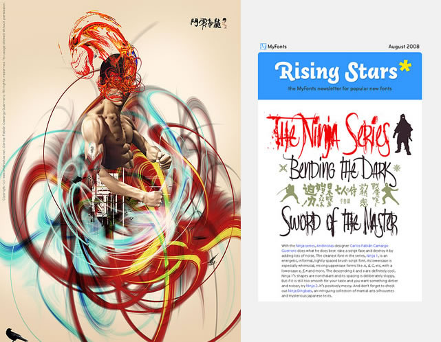
Ninja in “Myfonts: Rising Stars, August 2008”: With the Ninja series, Andinistas designer Carlos Fabián Camargo Guerrero does what he does best: take a script face and destroy it by adding lots of noise. The cleanest font in the series, Ninja 1, is an energetic, informal, tightly spaced brush script font. Its lowercase is especially whimsical, mixing uppercase forms like A, B, G, etc, with a lowercase e, f, n and more. The descending k and s are definitely cool. Ninja 1’s shapes are nonchalant and its spacing is deliberately sloppy. But if it is still too smooth for your taste and you want something dirtier and noiser, try Ninja 2. It’s positively messy. And don’t forget to check out Ninja Dingbats, an intriguing collection of martial arts silhouettes and mysterious Japanese texts. See this font latest comments in Flickr