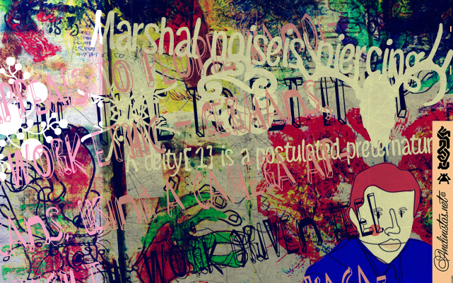
Naturalia font was designed by Carlos Fabián Camargo in 2012 and suggests an ultra-narrow, spontaneous and winding handwriting lettering, it is great for composing short and striking sentences. His idea behind not only alludes asymmetrical shapes but simple glyphs that compact vertical and tight proportions between lower case and upper case letters. Indeed, lower case letters have ascendant and descendant strokes shorter than the “x” height and width is generally condensed, saving horizontal space and supporting monolinear amount of contrast between thick and thin strokes accompanied by their sans serif endings.
Tag Archives: funny
Navaja Font by Andinistas
Navaja Font is a very few letter types with the context of grunge style fonts offer hierarchies to differentiate words in sentences or paragraphs. With Navaja I developed a font family that meets this need. This family is useful to organize the information into a hierarchy with an eroded look. Its central idea mixes grotesque, geometric and humanistic letter conventions. This way, Navaja is a grunge-sans with dense proportions to make graphic design with eroded character. Its main purpose appeared when one of my customers asked me for a t-shirt design for a fan club of an important football player. For this reason its starting point were stained and muddy letters characterizing the toughness and coldness of the sport.
Continue reading “Navaja Font by Andinistas”
Pomarosa font by Andinistas
Pomarosa is a typographic family that consists of capital roman letters and twisted lower case letters set randomly. Each one of them is characterized by its multiple calibers and widths. Pomarosa was planned to accompany graphic works done with different techniques and materials such as hand made collages.