Floro is a typographic family with 3 members designed by Carlos Fabián Camargo. Its idea combines medieval ideas, grotesque, stencil and grunge for T-shirts, stickers, advertising material design. More specifically the concept of Floro join several DNAís coordinating X height, ascendant, descendant and wide, in which proportions and adaptive optics were determined to inject great visual impact when composing titles. Its forms and counter forms have imperfections controlled with vitality and consistency. Floro is useful for ranking words and phrases with corroded edges and creases between the lines of his letters.
Tag Archives: mechanical
Pp Lepu font by Andinistas
Pp_lepu was started in 1999 and consists in the systematic distortion of the printed letters on movies stickers. Its design process was based on burning, getting wet, drying, sanding, copying and scanning with low resolution until getting an exclusive group of digitizings without curved lines. For this reason, Pp_lepu has a hardcore rhythm in its 4 variations; each one thought as raw material for graphic design related with cyberpunk atmospheres.
Continue reading “Pp Lepu font by Andinistas”
Diad font by Andinistas
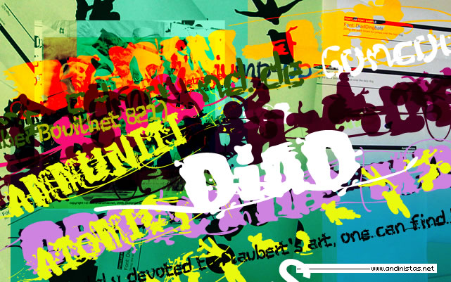
DiaD was born on 2000 in order to design posters about second World War. The original idea was obtained by breaking, burning and getting wet a bunch of written copies with an old writing machine. Today, this font is a small typographic system useful for bringing relevance to any content with a grunge look. Each and every detail passed through a strict experimentation process.